http://www.underconsideration.com/brandnew/archives/dont_mind_the_gap_or_the_square.php
http://finance.yahoo.com/family-home/article/110957/gap-changes-logo-why?mod=family-kids_parents
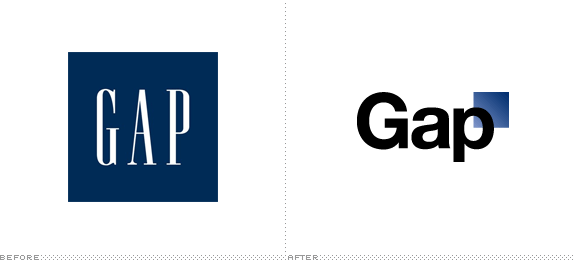
Thoughts? Will the new logo succeed in bringing in new customers, or will it simply alienate and disturb the customers who have the original Gap logo emblazzoned in their psyche?
I'm shocked that Gap would do this. Maybe a last ditch effort to save a floundering company? The original Gap logo, like it or not, is iconic.
ReplyDeleteWholeheartedly agree with gkozier on this one. The old Gap logo isn't great but it sure is iconic. I'm still having a hard time believing this redesign isn't a big joke for the design community.
ReplyDeleteSeriously, some designer was probably paid big bucks to do this and I can almost guarantee it took them all of three minutes to make this. Nice Helvetica and a box with a gradient...ha!
I want to know what the Gap's next move will be. I think their PR people should switch the logo back to the original and tell everyone they decided to play their April Fool's joke a little late.
Half the fun of re-branding is to retract the new logo within a month, change absolutely nothing, then watch everyone run to the store to proudly display their "new" old logo in a proud display of brand loyalty.
ReplyDeleteI agree, the logo looks like it was designed in a couple of minutes and the original Gap logo is iconic.